
Moving the needle: Building a Growth Model to grow faster - Part 1, the Macro picture


Not understanding growth is dangerous
To understand how your product grows, is essential to understanding what is most important to grow it further
I was working for a B2C company that had two main product lines. Combined together it seemed like growth was “fine”.
Digging deeper…
Product A: High margin, growth was plateauing
Product B: Low margin, growth was strong
We were headed for an unpleasant reality-check.
In short, we had a Retention problem with Product A, and no one saw it coming even though it could have been predicted years in advance.
When broken down into a series of inputs & outputs, it all makes a lot more sense. Problems in Acquisition, Activation, Conversion, longer term Engagement & Retention can all contribute in different ways.
So little time, so much to do
Every executive wants to see revenue growth, faster.
In our constrained reality, there are so many more ideas than time & resources allow. The quarter comes and goes like a flash.
How do we make the most impactful choices?
When I come in to a new company, there’s an essential activity that I never skip out on, and that’s building up an understanding of how the product(s) grow.
By understanding that, we can maximise the time spent on high leverage opportunities.
There’s only a certain distance we can go based on experience-based pattern matching, and heuristic analysis of where the new product might be lacking. Once these easier opportunities are captured, then we need a systematic way to drive growth.
An essential activity is to build a Growth Model, which allows us:
To understand mathematically how growth happens
Enabling prediction, and a clear overview of the system
Finding the highest leverage points
Gives us a structure to delve deeper to find the hidden relationships
Enabling us to discover the metrics that influence key product outcomes
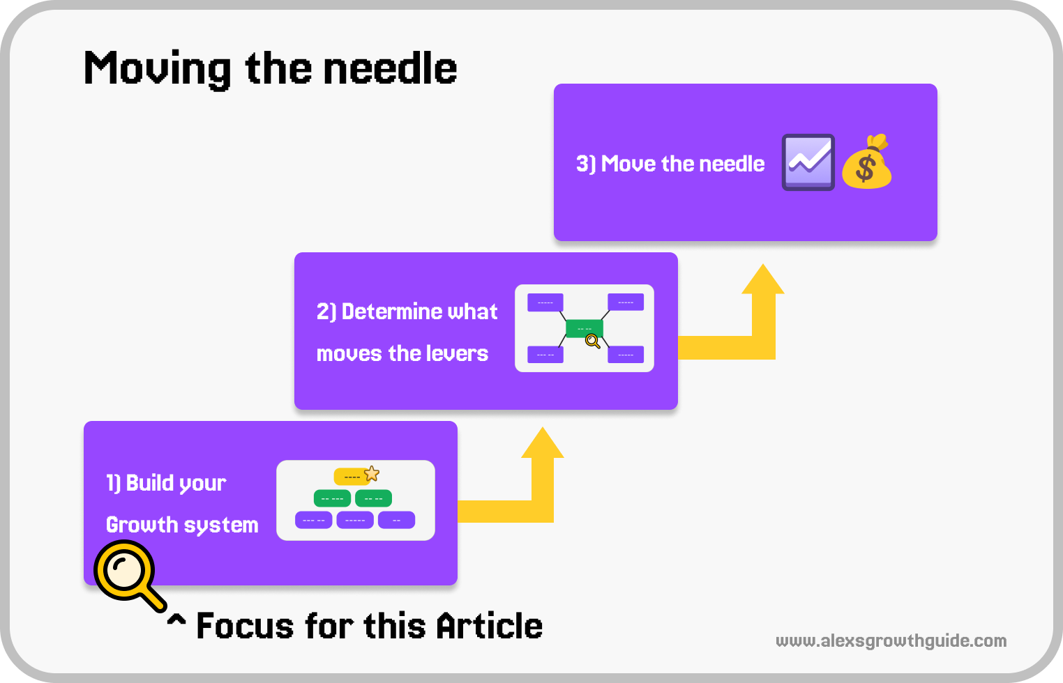
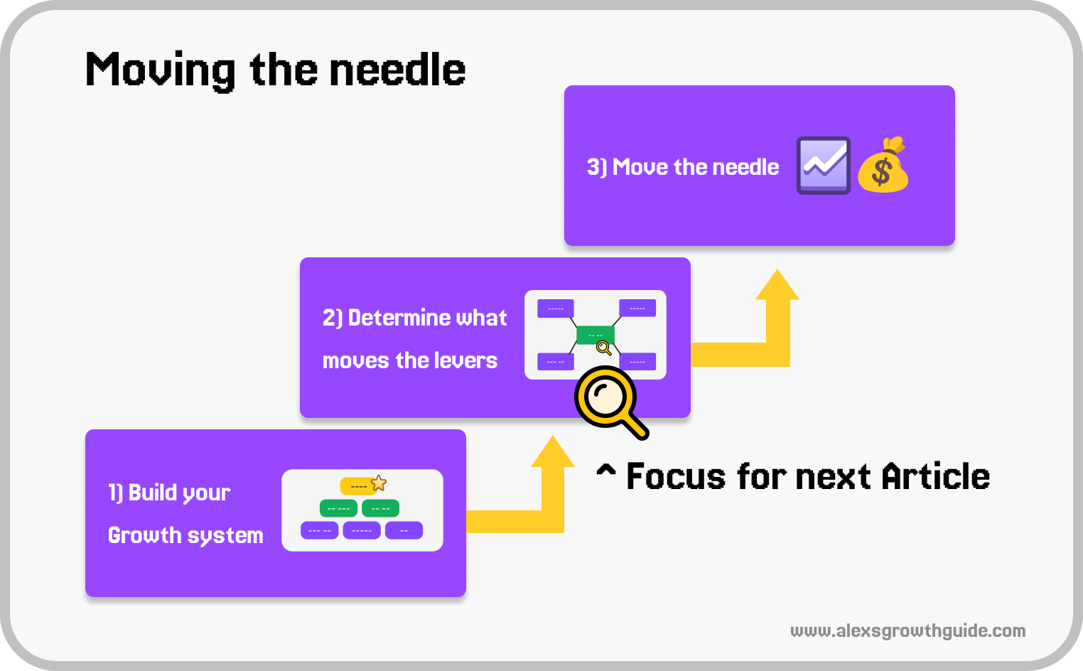
What we’ll do, in a nutshell
First, we build the Macro growth model.
Identifying KPIs that create growth
Next, we target an area, and develop the Micro growth model for that area.
Identifying Influencing factors that drive the hard Macro metrics
Finally, we can “Move the needle” - in other words, grow faster.
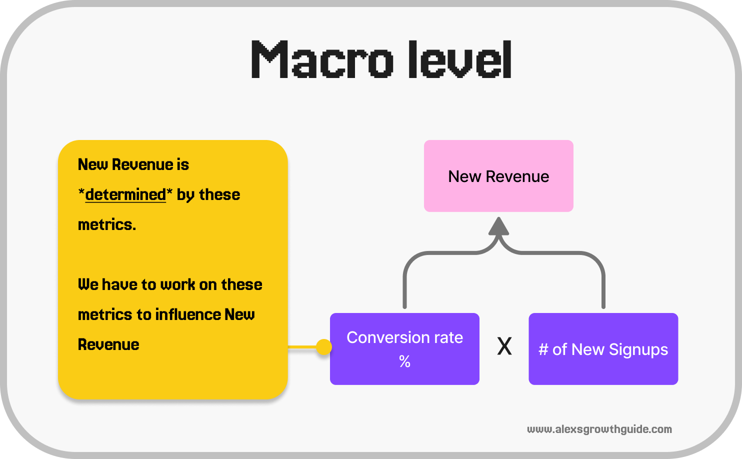
Difference between the Macro & Micro level
Macro level KPIs are somewhat “universal”, in that they hardly vary from product to product.
They have a deterministic relationship to each other, unlike Micro level KPIs which we’ll talk about next.
It’s fairly easy to map these out, and they serve the purpose of aligning your focus with others on what Business & Product Outcomes[1] you’re trying to influence.
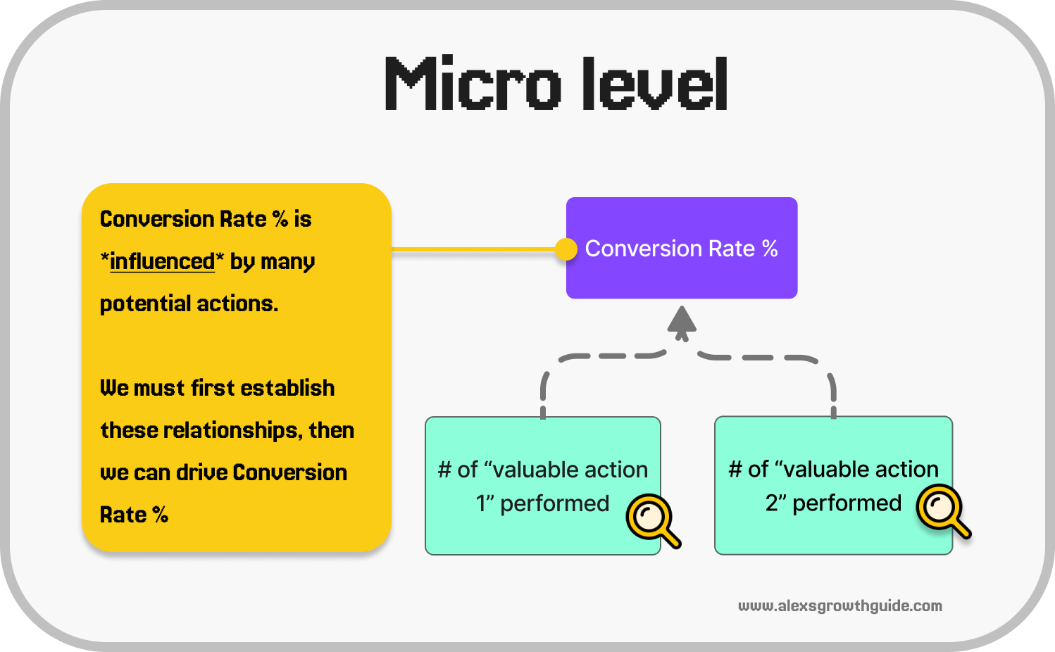
Micro level KPIs, what Teresa Torres might call a “Traction Metric”[1], have an influential relationship with the Macro level Product, and Business outcomes. By influential, I mean the Micro level influences the Macro to a degree, but it’s not a 1:1 relationship.
Discovering these connections requires a deep curiosity for what your users find valuable and a persistence to establish a measurable connection in the data.
Example of the intended outcome:
We have a B2C content creation tool
You’ve mapped out your Business & Product metrics to understand how you grow.
Your conclusion is that improving your Trial Conversion rate is the highest leverage activity, much better than Signup improvements ✅
You investigate the relationship between certain key actions and Trial Conversion
You find that users who export their first file by Day 2 have a 2X higher chance of trial conversion ✅
You can now Move the Needle
Focus on mapping out opportunities in the new user experience to enable more users to export within 2 days ✅
The timeframe gives constraints around how you need to approach the problem space ✅
So let’s move on to the focus for Part 1: The Macro perspective
Part 1: Understanding your growth from a Macro perspective
What does it look like?
You might have seen/read about a “KPI Tree” before.
It’s an interconnected set of metrics, built to model how different parts of a system affect each other.
e.g. Increase conversion rate → New Revenue increases
This enables us to:
Understand how revenue is created. Predict future growth → Plug in your numbers, and you’ll have a decent view of future growth of the system, and
Understand how value is created. And, how value relates to revenue, once we go deeper into the Micro actions that influence the overall model
Example:
Here’s a visual representation of the “Macro” part of a KPI Tree for a SaaS product with monthly & trial subscriptions:
It doesn’t need to be exhaustive, since the main goal here is to create a high level view, and understand which areas are most promising.
We could break this down further, e.g. see below, but for now the broad overview is most important.
And what it could look like in a spreadsheet:
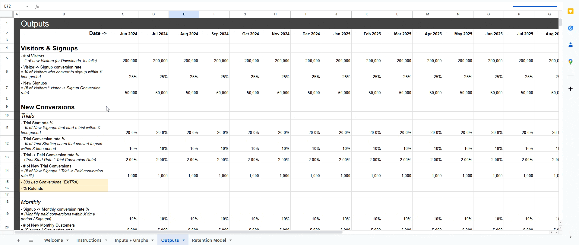
Once you have it in spreadsheet form, we can do the fun part → use it to see where we have the most leverage.
Setting up your KPI tree
Example:
We have a generic SaaS product a single monthly plan
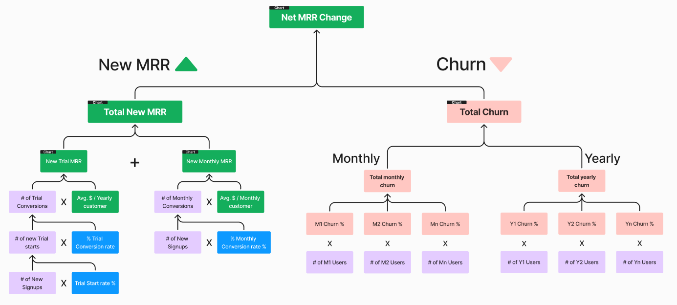
Firstly, how does your product make money?
→ It’s the sum of new revenue, plus revenue from existing customers (recurring revenue), minus the churn.
New Revenue
New Revenue = New Customers * Average $ / Customer
New Customers = New Signups * Signup → Customer Conversion Rate %
New Signups = Unique Visitors * Visitor → Signup Conversion Rate %
Recurring revenue
Comes from existing customers, which are existing Yearly + Monthly customers
Churned revenue
I’ll use the massive oversimplification of a flat % churn against the existing revenue base = Existing Revenue * Churn %
This holds only for established products where the growth & churn rates have reached a sort of equilibrium, but for this exercise it’s far easier.
The above, represented visually:
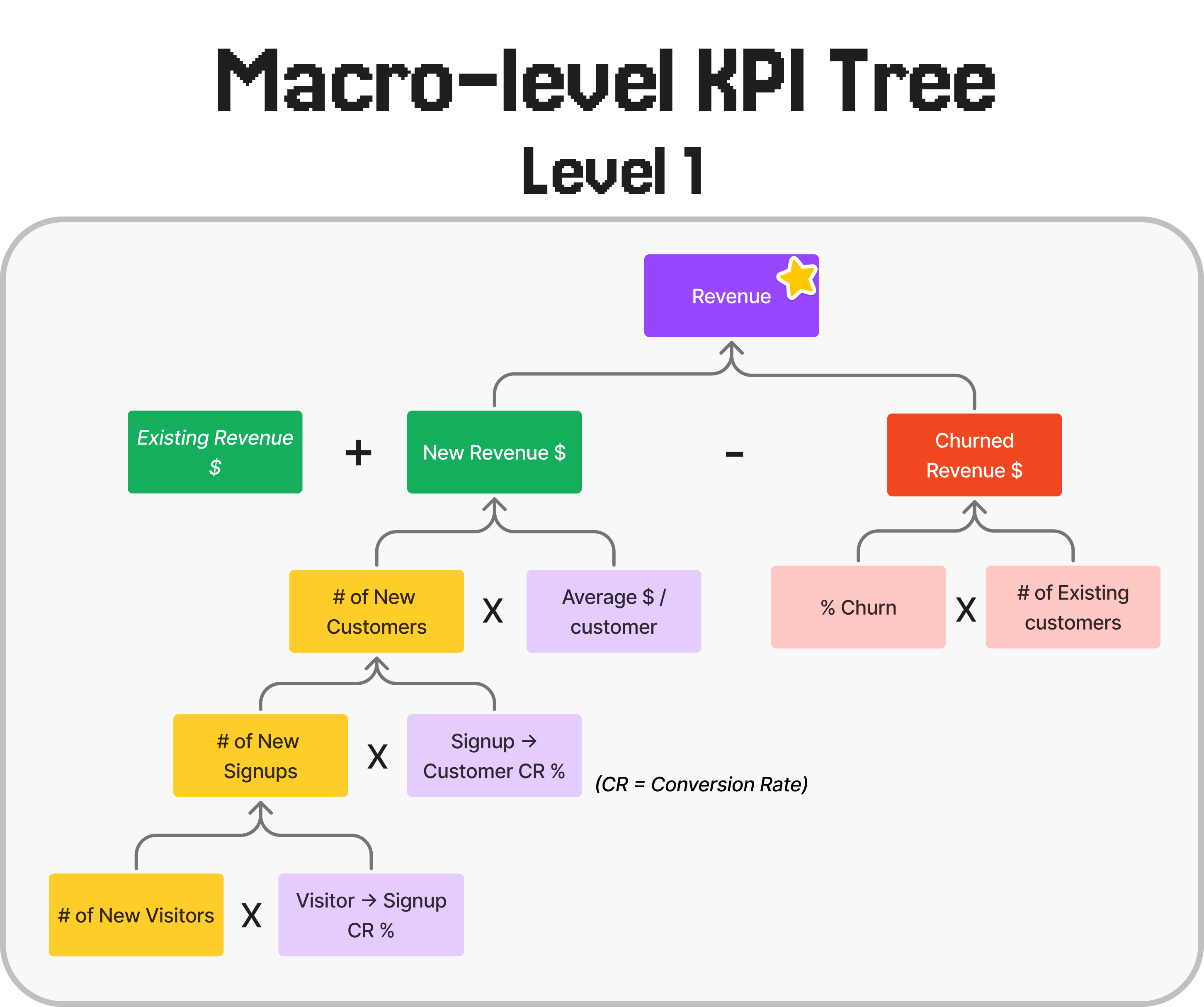
We have the bones of a basic KPI tree!!! 🎉🎉🎉
Going a level deeper
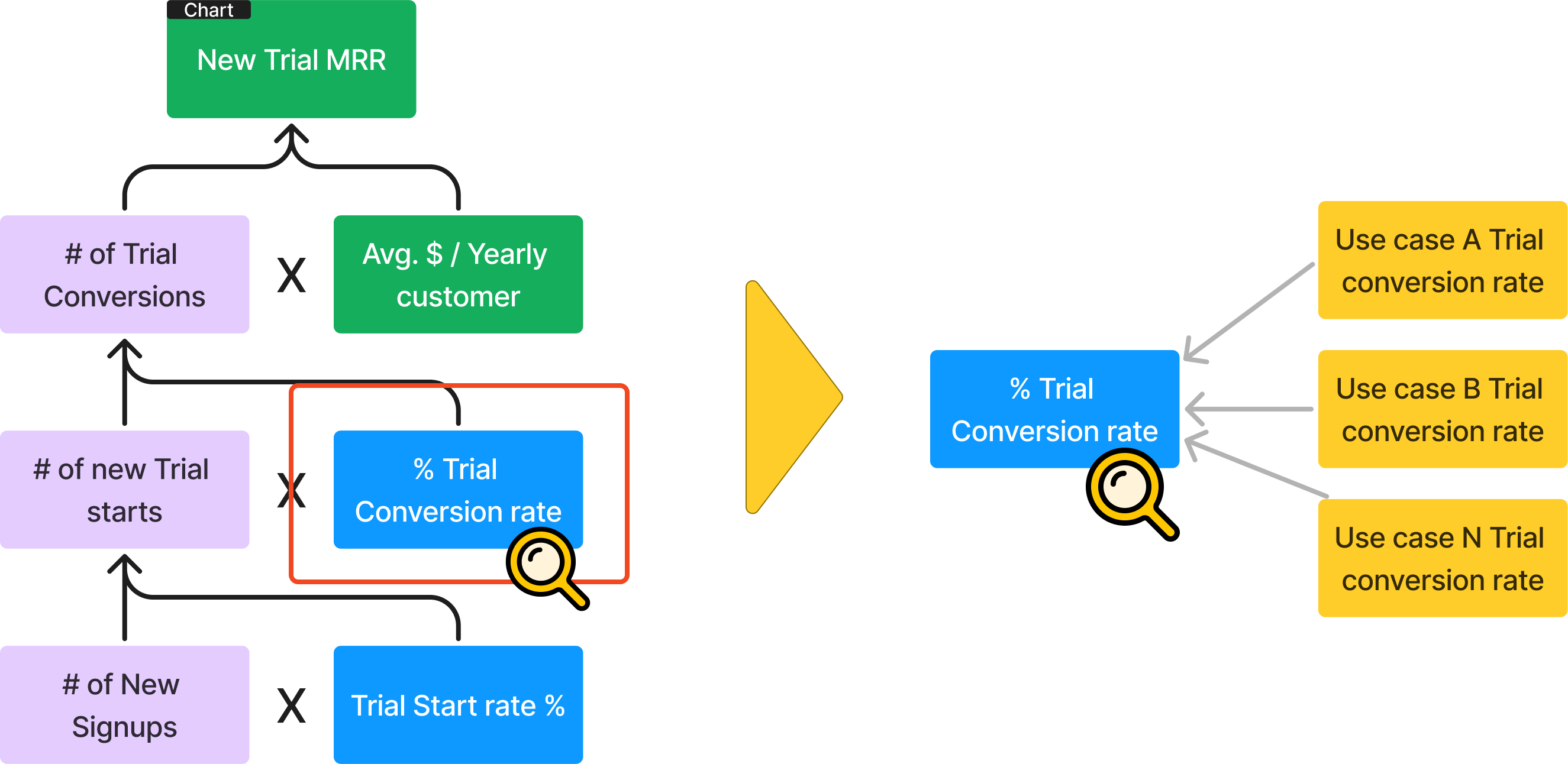
Each of the steps we have listed consist of many substeps.
If we break them down one level further, we’ll have enough detail to start calculating leverage.
How much detail is enough?
It’s possible to go to extreme detail e.g. literally every must-do action, but at first I’d recommend building an overview of the distinct sub-journeys.
So, something like this could make sense for Visitor → Signup:
Visitor → Start signup
Start Signup → Account Created
Account Created → Completed Segmentation Survey (for example, a short survey which asks who they are, what kind of work they hope to accomplish with the product)
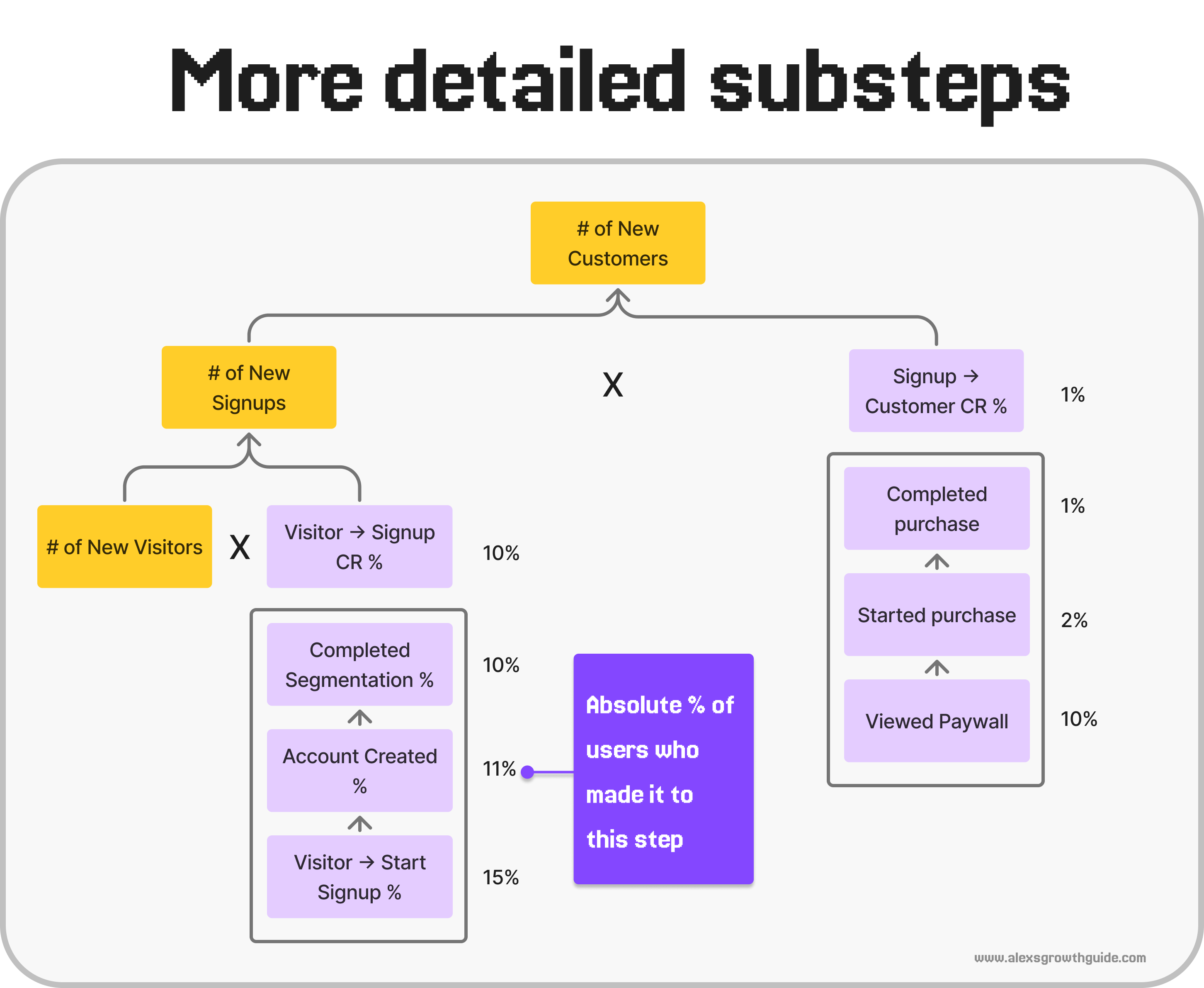
So now, in terms of influencing New Revenue, we can put this in a spreadsheet to get what we need.
We’ll use “relative” conversion rates, since that makes more sense for identifying opportunities.
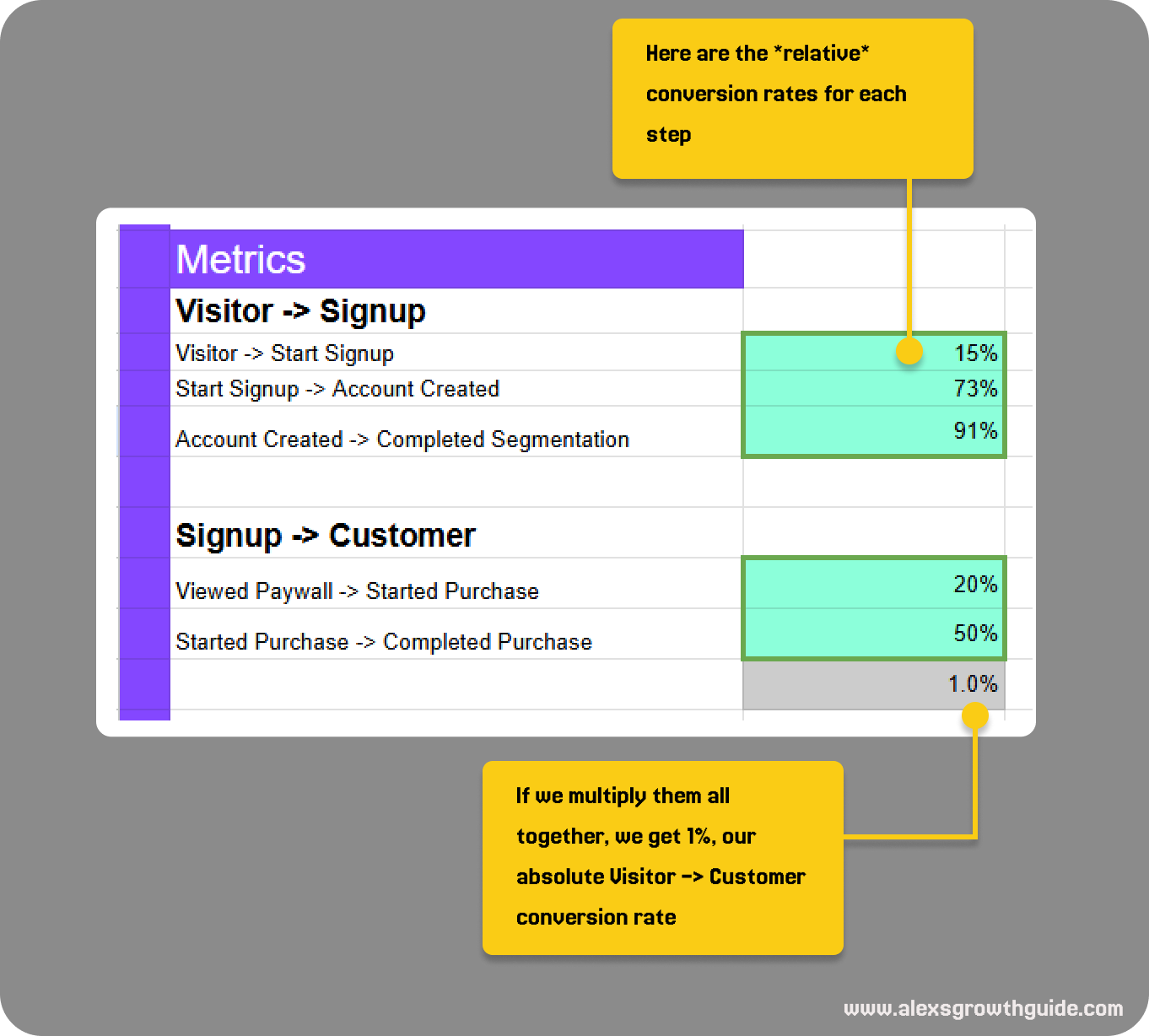
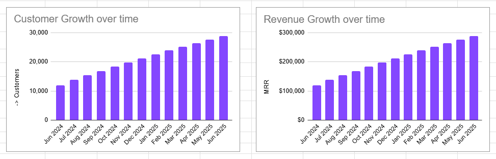
Putting it all together with some example Visitor numbers & Revenue / customer, and we can model the system over time, getting an output like the one below:
Okay cool, but without having an idea of where to focus, this is not useful.
Finding leverage
Where can you make the most impact?
It’s usually where most of the pain/friction between the user & value exists. But we haven’t really mapped out value creation yet. (that comes in Part 2)
We don’t have the time to deep dive into every small part of the journey, so we can use the following exercises to find areas of interest to explore further.
It’s also dependent on how much there is even left to gain, and that’s why mapping out the numbers is crucial. As we’ll see next, some steps are naturally limited in the amount of gains we can even make.
The mathematical
Imagine you could improve any step by a 10% relative increase in conversion rate.
What would the overall uplift on the system be?
Always, 10%*.
(*As long as that doesn’t bring that step to above 100%)
In other “words” → A * B * 1.1 = 1.1 * A * B
The problem is, each step has a WILDLY different opportunity for uplift. In my experience, of users who begin a signup process, roughly 70-90% will complete it.
For a paywall, it might be only 10% that see it, end up buying.
So for these two scenarios, if we add a relative 10% uplift:
10% increase on 90% brings it to 99%.
10% increase on 10%, brings it to 11%.
Which do you think is more realistic?
In reality, 1. will never happen, but 2. is generally achievable.
Simple rule of thumb:
When conversion rates are lower, e.g. <30%, then we’re looking for 10-20% uplift milestones on that converting share.
When conversion rates get very high, the better way to think about it is that you’re trying to convert a % of the remaining non-converters. e.g. for the 90% conversion step, it’s the remaining 10% that we want to capture 10-20% of.
Shown mathematically:
100-90 = 10, then 10*1.1 = 1%, therefore 90% → 91% = 1% uplift on the system
10% → 11% = 10% uplift on the system
This means that a similarly realistic goal for Signup & Paywall conversion would be an order of magnitude different in terms of impact.
The closer you are to the conversion rate ceiling, the ever more marginal the gains.
A 90% conversion rate step can never exceed 11% relative improvement.
A 10% conversion rate step can eventually gain 30-100% over months and years.
This means we’re generally going to be biased to favour low-conversion steps for improvement
The subjective
As mentioned earlier, where’s the pain?
You must form a strong opinion on the flows you’re responsible for, and keep it up to date.
You might have a best-in-class signup experience, but if your Paywalls are still default templates, you might have a strong hunch that the opportunity there is significant.
These judgements inform the mathematical side.
The main sources of this information are:
Customer feedback → Customer service, interviews, surveys, session recordings
Competitor awareness → Knowing how the strongest rivals approach their UX, and also non-competitors who simply do those types of experiences well
Your own product sense → The longer you spend in the business of making lives easier, the easier it is to detect potential problems
The benchmarks?
In my view, these aren’t going to be super helpful → Why? Because every product has subtly different customers, geographies, and definitions about terms.
There can be some value in them, but I think they can take energy from the hard work of gaining an ever-deepening understanding of your unique userbase.
Example Macro Growth Model spreadsheet
Here’s an example spreadsheet of a basic KPI Tree that you can play around with.
Visual representation:

What next?
We’re going to get to the fun part, which is: Diving into the Micro → Identifying influencing factors. What good is knowing I want to drive Trial Conversion, if I don’t know what influences it?
Additional Reading
Petra Willie on KPI Trees https://www.petra-wille.com/blog/kpi-trees-how-to-bridge-the-gap-between-customer-behavior-product-metrics-and-company-goals
Teresa Torres on Opportunity-Solution Trees, a strongly related topic: https://www.producttalk.org/2023/12/opportunity-solution-trees/
Appendix
[1] I use the following terms as defined by Teresa Torres here
Business outcomes measure the health of the business and are typically financial metrics like grow revenue, increase market share, or reduce churn. e.g. New Monthly Recurring Revenue
Product outcomes typically measure a customer behavior in the product or a customer sentiment about the product. e.g. Signup completion Conversion rate %
Traction metrics measure adoption of a single feature. e.g. % of users who make their first export within 1 day of signup